As a business, any business, it’s vital that you know exactly what’s going on in every part of the operation and how different sections of the company are impacting other parts of the value chain in order to ensure repeated business success, while driving improvement and transformation across the organisation as a whole.
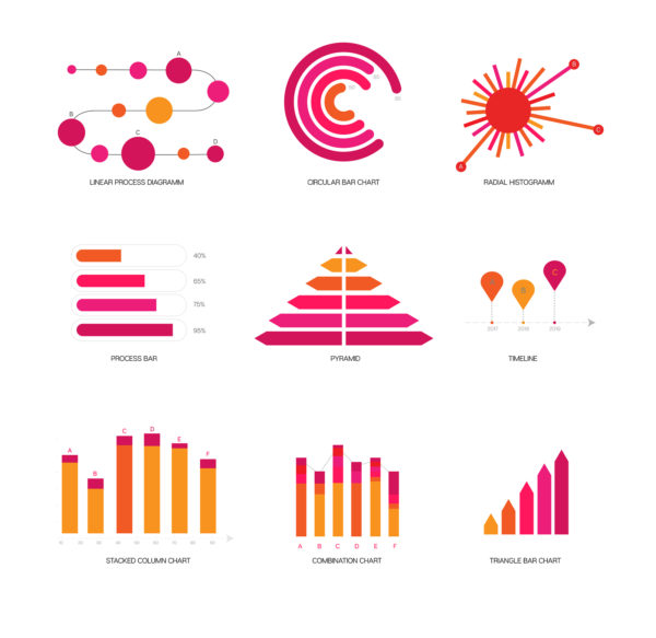
Data visualisation, the presentation of information in graphical format, is key to helping firms get to grips with this, allowing you to see your data analytics presented in a visual form. This makes it far easier to gain a deeper level of understanding with regards to complex concepts or to spot new patterns and trends across your company.
The technology that we’re lucky enough to have at our disposal these days can then be used to delve deeper into the charts and graphs for even more detailed reviews. Imagine only having dry reports and spreadsheets to pore over when trying to understand the huge amounts of complex data you’ve amassed – it would be practically impossible to make any meaningful decisions in a timely fashion.
But charts and graphs can help your brain to process information so you can understand concepts quicker and more effectively. You can then play around with these formats so you can imagine different scenarios and spot areas that need improvement or attention, predict sales, know where to place certain products and see what factors influence consumer behaviour in a clearer way.
Here at Experimentus, we work with companies to identify relevant information and introduce the processes and tools required to collect, analyse and present the metrics in such a way that supports the needs of your company.
For further information on this and software quality processes, get in touch with us today.


Leave a Reply